User Guide#
ProgressiVis is a language and system implementing progressive data analysis and visualization. ProgressiVis is designed to never block while executing functions, even if their execution time lasts an unbounded amount of time. For example, when loading a large file from the network until it is completed.
In a traditional computation system, you cannot do much about the time taken when calling a function. Waiting while loading a large file over the network is the price to pay for having it loaded and initiating computations based on its contents. In a non-progressive system meant to be used interactively, when a function takes too long to complete, the user waits, gets bored, and their attention wanes. ProgressiVis is designed to avoid this attention drop.
If you are familiar with asynchronous programming or real-time programming, you will be aware of the need to follow strict disciplines to ensure a system does not block. This discipline is implemented everywhere in progressiVis with a specific “progressive” semantics.
Key concepts#
ProgressiVis utilizes specific constructs to remain reactive and interactive at all times. Let’s start with a simple progressive program to introduce the concepts. Assume we want to determine the busiest places in New York City. We can download the New York Taxi dataset, which contains all taxi trips from 2015 and 2016, including pickup and drop-off positions, to identify hot spots.
For January 2015, the file yellow_tripdata_2015-01.csv.bz2 is 327 MB in compressed form and contains approximately 12 million lines (12,748,987). Downloading the file and uncompressing it before the data is loaded in memory can take minutes. Meanwhile, the user is waiting idly with no information about the file content.
With ProgressiVis, we don’t need to wait for the file to be fully loaded to visualize it; we can do it on the go, as with this simple, low-level ProgressiVis program.
All the programs shown here are available in the notebook directory of ProgressiVis as userguide1.ipynb, userguide1.2.ipynb and userguide1.3.ipynb so you don’t have to copy/paste them from this documentation. To run the examples, connect to the progressivis directory you downloaded from github.com and launch the Jupyter Lab notebook by typing, in a command line:
jupyter lab --ServerApp.iopub_msg_rate_limit=10000
Then, open the notebooks directory and load the notebook userguide1.ipynb. The code you see next should appear, with a few additional comments. You can run the notebook cells with the “play” icon on top.
 1from progressivis import CSVLoader, Histogram2D, Quantiles, Heatmap
 2
 3LARGE_TAXI_FILE = ("https://www.aviz.fr/nyc-taxi/"
 4                   "yellow_tripdata_2015-01.csv.bz2")
 5RESOLUTION=512
 6
 7# Create the modules
 8csv = CSVLoader(LARGE_TAXI_FILE,
 9                usecols=['pickup_longitude', 'pickup_latitude'])
10quantiles = Quantiles()
11histogram2d = Histogram2D('pickup_longitude', 'pickup_latitude',
12                          xbins=RESOLUTION, ybins=RESOLUTION)
13heatmap = Heatmap()
14
15# Connect the modules
16quantiles.input.table = csv.output.result
17histogram2d.input.table = quantiles.output.table
18histogram2d.input.min = quantiles.output.result[0.03]
19histogram2d.input.max = quantiles.output.result[0.97]
20heatmap.input.array = histogram2d.output.result
21
22# Display the Heatmap
23heatmap.display_notebook()
24
25# Run the program
26csv.scheduler.task_start()
The image of all the taxi pickup positions appears immediately. All taxi pickup positions are overlaid at each pixel to produce a density map that becomes progressively more detailed, revealing the shape of Manhattan and the two New York City airports: LaGuardia, located in the center top, and JFK, at the bottom right. Yellow taxis in NYC are only authorized to pick up clients in Manhattan and at the airports, or when returning from their drop-off location; this is visible in the visualized patterns.
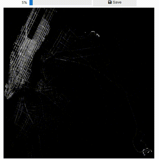
With a standard visualization system or using Pandas from Python, you would have to wait several minutes to see the visualization due to the file’s load time. ProgressiVis displays results in a few seconds, improving over time, regardless of file size and network speed.
Let’s explain the program. Line 8 creates a CSVLoader module, providing the URL of the taxi datasets and limiting the table to two columns: pickup_longitude and pickup_latitude that will be used in the example.
When created, the module does not start immediately, but rather after line 26, when the entire program is initiated.
Then, on line 10, a Quantiles module is created to compute quantiles of the two columns, so you can get the median value (0.5 quantile) or any other quantile value.
The Quantiles module will maintain an internal data structure to quickly (but approximately) compute quantiles over all the loaded numerical columns (it is called a data sketch). This is because the minimum and maximum of the dataset are noisy.
ProgressiVis is designed for scalability and managing big data, which is never clean; the taxi dataset is no exception. Using the absolute minimum and maximum values of the data column would produce weird results. Instead, we are using the 3% and 97% percentiles (0.03 and 0.93 quantiles), maintained progressively, to filter out the outliers.
On line 11, a Histogram2D module is created to count all the pickup locations (longitudes and latitudes) on a 512x512 array/grid.
The last module, a Heatmap, is created on line 13. It will convert the histogram array into a displayable image.
Then, the modules are connected.
Modules have input and output slots to connect them, allowing data to flow between one module’s output into another module’s input. The slots are usually typed, so the CSVLoader output slot produces a data table, and the Quantiles module expects a data table in its input, as shown in line 16.
We use the sign equal (=) as a convenient syntax to express a connexion.
You could interpret it as a Slot object, created by an output slot and being shared with the input slot.
On line 17, the Quantiles output slot table is connected to the input slot table of the Histogram2D module.
On line 18 and 19, the min and max input slot of the Histogram2D module are connected to the result output slot of the Quantile module, but using a parameter between brackets. This parameter is called a slot hint. In that context, it specifies the desired quantiles that should be extracted, here the 3% and 97% quantiles computed by the Quantiles module.
When connecting slots, ProgressiVis allows specifying arguments to provide details about the connection; these are called “slot hints”. For the output slot “result” of the Quantiles module on lines 16-17, the argument is simply the desired quantile between 0 and 1.
Finally, on line 20, the Heatmap module is connected to the output of the Histogram2D module. It will convert 2D histograms into an image ready to be displayed in the notebook, as shown in line 23.
The progressive program is started on line 26, and the image will appear almost immediately, improving over time. The bounds may shift slightly when more points are loaded. In that case, the image will be redisplayed progressively with the new bounds on the same page, approximately every 2-3 seconds.
At this stage, ProgressiVis is used to visualize data immediately in streaming mode, loading data and visualizing the results as it is processed. We will introduce interaction later, after introducing the concepts first.
Variations of this program are discussed in a follow-up section, if you are interested in more details about loading a large CSV file.
Main Components#
In ProgressiVis, a program is run by a Scheduler. Only one instance of Scheduler exists (except in tests), and in our example, it is passed implicitly everywhere.
A progressive program is internally represented as a dataflow of progressive modules (simply called modules in this documentation).
The dataflow is a directed network with no cycle (a directed acyclic graph or DAG).
A Module represents the equivalent of a function in a traditional Python program.
It is made of input and output slots; one output slot of a module can be connected to several input slots of other modules.
Some input slots are optional, and others are mandatory for a module to run.
Furthermore, a slot is typed since it carries data between modules.
A module with no input slot is a source module, and a module with no output slot is a sink module.
When specifying a connection, input slots can be supplemented by hints, provided in square brackets. The role and type of hints depend on the semantics of the slot. In the next example, the sequence of names provided in square brackets designates the columns to be taken into account (and processed) by the module:
from progressivis import RandomTable, Max, Tick

random = RandomPTable(10, rows=10000)
# produces 10 columns named _1, _2, ...
max_ = Max()
max_.input[0] = random.output.result["_1", "_2", "_3"]
# slot hints to restrict the columns to ("_1", "_2", "_3")
pr = Tick('.')
pr.input[0] = max_.output.result
random.scheduler.task_start()
Here, the hint tells the Max module to compute the maximum only for columns “_1”, “_2”, “_3”.
Otherwise, when no hint is provided, the maximum is computed for all the columns.
In addition to input and output slots, a module maintains a set of parameters that it uses internally. Finally, some modules are interactive and can receive events, typically from the user interface or visualization interactions to control (stop, resume, step the execution) or steer the computation.
Most progressive programs are composed of existing modules, created with specific parameters and connected to form a specific program. However, new modules can be programmed to implement a new function, to add an algorithm, a loader for a new file format, or a new visualization. Programming a module is explained in the advanced section of this documentation.
Running a Progressive Program#
The easiest environment to run progressive programs is Jupyter Lab notebooks. ProgressiVis comes with widgets, visualizations, and mechanisms to navigate notebooks in a non-linear way to follow the progression of modules. ProgressiVis offers two levels of programming: a low-level, as shown in the first example above, and a high-level designed for Jupyter Lab notebooks, more convenient, hiding boilerplate code and providing convenient widgets and navigation mechanisms to manage the non-sequential style of ProgressiVis programs.
Alternatively, progressive programs can be run in a headless environment.
Dynamic Modification of a ProgressiVis Program#
A running ProgressiVis program can be modified. Running this simple program will show one dot per chunk loaded.
from progressivis import CSVLoader, Min, Tick

LARGE_TAXI_FILE = ("https://www.aviz.fr/nyc-taxi/"
                   "yellow_tripdata_2015-01.csv.bz2")

csv = CSVLoader(LARGE_TAXI_FILE, usecols=['pickup_longitude', 'pickup_latitude'])
m = Min(name="min")
prt = Tick(tick='.')
m.input.table = csv.output.result
prt.input.df = m.output.result
csv.scheduler.task_start()
Adding a branch to this program can be done like this:
with csv.scheduler as dataflow:
    M = Max(name="max")
    prt2 = Tick(tick='/')
    M.input.table = csv.output.result
    prt2.input.df = M.output.result
the with construct is called a “context manager”. When it ends, it verifies that the new program is valid and updates the scheduler.
If not, it triggers an exception without changing the program run by the scheduler.
Similarly, modules can be removed like this:
with csv.scheduler as dataflow:
    deps = dataflow.collateral_damage("min")
    print("The collateral damage of deleting min is:", deps)
    dataflow.delete_modules(*deps)
The method Dataflow.collateral_damage() computes the set of dependent modules to remove from the dataflow to remove the specified module so that the dataflow remains valid. In our case, removing the “min” module should also remove the “Tick” module connected, but not the “csv” module.
You should always pass the list of dependent modues to Dataflow.delete_modules() so you know what you are doing, you cannot pretend ProgressiVis removed some modules without you being aware!
Communication between ProgressiVis and the Notebook#
ProgressiVis is built on top of Python asynchronous functions. The communication between ProgressiVis and the notebook is done through callbacks and function calls. Module callbacks are handy to update the environment outside of ProgressiVis. For example, visualizing the heatmap shown in the first example works like this (see also the Jupyter Notebook widgets documentation at ipywidgets.readthedocs.io):
 1import ipywidgets as ipw
 2from IPython.display import display
 3
 4# Create an empty Image widget and display it in the notebook
 5img = ipw.Image(value=b'\x00', width=width, height=height)
 6display(img)
 7
 8# Define a callback that runs after the heatmap module is updated
 9def _after_run(m: Module, run_number: int) -> None:
10    assert isinstance(m, Heatmap)
11    image = m.get_image_bin()  # get the image from the heatmap
12    if image is not None:
13        img.value = image
14        # Replace the displayed image with the new one
15
16heatmap.on_after_run(_after_run)  # Install the callback
On the other hand, an external function can trigger changes in a ProgressiVis program in a few ways. There is a low-level mechanism based on the method Module.from_input(msg) that allows communicating with modules. The module Variable is the simplest module designed to handle external events through from_input. Its implementation of from_input expects a dictionary that is then propagated as data in its output slot in the progressive program. Most of the interactions proposed in ProgressiVis are done through Variable modules. Reusing the same declarations as in the examples above, we can add dynamic filtering to the data being progressively loaded with the following code:
 1from progressivis import (CSVLoader, Histogram2D, Heatmap, PDict,
 2                          BinningIndexND, RangeQuery2D, Variable)
 3
 4col_x = "pickup_longitude"
 5col_y = "pickup_latitude"
 6
 7csv = CSVLoader(LARGE_TAXI_FILE, usecols=[col_x, col_y])
 8index = BinningIndexND()
 9query = RangeQuery2D(column_x=col_x, column_y=col_y)
10var_min = Variable(name="var_min")
11var_max = Variable(name="var_max")
12histogram2d = Histogram2D(col_x, col_y, xbins=RESOLUTION, ybins=RESOLUTION)
13heatmap = Heatmap()
14
15index.input.table = csv.output.result[col_x, col_y]
16query.input.lower = var_min.output.result
17query.input.upper = var_max.output.result
18query.input.index = index.output.result
19query.input.min = index.output.min_out
20query.input.max = index.output.max_out
21histogram2d.input.table = query.output.result
22histogram2d.input.min = query.output.min
23histogram2d.input.max = query.output.max
24heatmap.input.array = histogram2d.output.result
25
26heatmap.display_notebook()
27csv.scheduler.task_start();
Visualizing the dataflow graph shows a cleaner view of the structure of the program.
Compared to the initial non-interactive program, we have added lines 12-26. Line 13 creates a BinningIndexND that progressively maintains an index to all the numerical columns, allowing for quickly performing range queries over a large dataset. It is connected to the CSV module on line 15, with a slot hint restricting it to maintaining the index on two columns.
Line 17 creates a RangeQuery2D module that creates a table filtered by a 2D range query. The outputs of this module are connected to the Histogram2D module on lines 30-32 instead of the min/max quantiles and the table produced by the CSV table in the first example. The RangeQuery2D module outputs the current min/max ranges and the table filtered according to these ranges to the Histogram2D module, which gets visualized like in the first example. The RangeQuery2D module takes two variables var_min and var_max, declared line 19-20m to specify the desired min-max range that the user wants to see. The variables can be controlled by a Jupyter notebook range-query widget to pass the information from the notebook to the progressive program, as shown in the next listing.
 1import ipywidgets as widgets
 2import progressivis.core.aio as aio
 3
 4# Yield control to the scheduler to start
 5await aio.sleep(1)
 6
 7# Define the bounds for the range-slider widgets
 8bnds_min = PDict({col_x: bounds.left, col_y: bounds.bottom})
 9bnds_max = PDict({col_x: bounds.right, col_y: bounds.top})
10
11# Assign an initial value to the min and max variables
12await var_min.from_input(bnds_min)
13await var_max.from_input(bnds_max);
14
15long_slider = widgets.FloatRangeSlider(
16    value=[bnds_min[col_x], bnds_max[col_x]],
17    min=bnds_min[col_x],
18    max=bnds_max[col_x],
19    step=(bnds_max[col_x]-bnds_min[col_x])/10,
20    description='Longitude:',
21    disabled=False,
22    continuous_update=False,
23    orientation='horizontal',
24    readout=True,
25    readout_format='.1f',
26)
27lat_slider = widgets.FloatRangeSlider(
28    value=[bnds_min[col_y], bnds_max[col_y]],
29    min=bnds_min[col_y],
30    max=bnds_max[col_y],
31    step=(bnds_max[col_y]-bnds_min[col_y])/10,
32    description='Latitude:',
33    disabled=False,
34    continuous_update=False,
35    orientation='horizontal',
36    readout=True,
37    readout_format='.1f',
38)
39def observer(_):
40    async def _coro():
41        long_min, long_max = long_slider.value
42        lat_min, lat_max = lat_slider.value
43        await var_min.from_input({col_x: long_min, col_y: lat_min})
44        await var_max.from_input({col_x: long_max, col_y: lat_max})
45    aio.create_task(_coro())
46long_slider.observe(observer, "value")
47lat_slider.observe(observer, "value")
48widgets.VBox([long_slider, lat_slider])
Lines 11 and 12 use the Module.from_input method to initialize the
value of var_min and var_max to bnds_min and bnds_max respectively.
Then, two range sliders are created on lines 14 and 26 to filter a range of values
between the specified bounds of the visualization.
The observer() function is attached as a callback of these two sliders to collect the
slider values and send them to var_min and var_max on lines 42-43.
Setting them in the callback will force the histogram to recompute with the new bounds and, in turn, trigger an update of the heatmap every time the sliders are moved.
Building a progressive visualization and making it interactive is conceptually easy with ProgressiVis, but it may require a lot of boilerplate code. To simplify the construction of complex loading, analysis, and visualization of progressive pipelines, we provide higher-level abstractions in Jupyter Lab notebooks. They are documented in the notebooks section.
Dealing with Noisy Data#
Big data is almost always noisy. The techniques that work on small data should be adapted to overcome this noise. As an illustration, the simplest program we can think of to visualize the New York Taxi dataset is the following:
 1from progressivis import CSVLoader, Histogram2D, Min, Max, Heatmap
 2
 3LARGE_TAXI_FILE = ("https://www.aviz.fr/nyc-taxi/"
 4                   "yellow_tripdata_2015-01.csv.bz2")
 5RESOLUTION=512
 6
 7csv = CSVLoader(LARGE_TAXI_FILE,
 8                usecols=['pickup_longitude', 'pickup_latitude'])
 9min = Min()
10max = Max()
11histogram2d = Histogram2D('pickup_longitude', 'pickup_latitude',
12                          xbins=RESOLUTION, ybins=RESOLUTION)
13heatmap = Heatmap()
14
15min.input.table = csv.output.result
16max.input.table = csv.output.result
17histogram2d.input.table = csv.output.result
18histogram2d.input.min = min.output.result
19histogram2d.input.max = max.output.result
20heatmap.input.array = histogram2d.output.result
Instead of using the Quantiles module presented in the first example, it simply uses Min and Max to obtain the bounds of the pickup positions before computing the heatmap image.
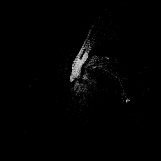
It works as well, but the resulting image is unexpected:

This is due to taxis driving to Florida (bottom right, sometimes invisible on high-resolution displays) or other far-away places and forgetting to stop their meters.
The Quantiles module allows getting rid of outliers that always exist in real data, which is always noisy.
Alternatively, you may know the boundaries of NYC and specify them:
 1from progressivis import CSVLoader, Histogram2D, ConstDict, Heatmap, PDict
 2from dataclasses import dataclass
 3
 4LARGE_TAXI_FILE = ("https://www.aviz.fr/nyc-taxi/"
 5                   "yellow_tripdata_2015-01.csv.bz2")
 6RESOLUTION=512
 7
 8@dataclass
 9class Bounds:
10    top: float = 40.92
11    bottom: float = 40.49
12    left: float = -74.27
13    right: float = -73.68
14
15bounds = Bounds()
16col_x = "pickup_longitude"
17col_y = "pickup_latitude"
18
19csv = CSVLoader(LARGE_TAXI_FILE, usecols=[col_x, col_y])
20min = ConstDict(PDict({col_x: bounds.left, col_y: bounds.bottom}))
21max = ConstDict(PDict({col_x: bounds.right, col_y: bounds.top}))
22histogram2d = Histogram2D(col_x, col_y,
23                          xbins=RESOLUTION, ybins=RESOLUTION)
24heatmap = Heatmap()
25
26histogram2d.input.table = csv.output.result
27histogram2d.input.min = min.output.result
28histogram2d.input.max = max.output.result
29heatmap.input.array = histogram2d.output.result
30...
The result is then perfect, but you need to provide extra information, i.e., the boundaries of the image.